Strong wool warp,
a funky, functional plastic loom1,
a word that wants to be woven—
and a sweet dog who seems to agree that spending the day in the shade of a benevolent fir is just the thing—
can it get any better?
Well there is the wee problem of the light; this corner of the deck faces southwest and backlighting is not ideal for precise work.
But it’s not often a gal gets to see her letters outlined with sunshine.
And my hands mostly know what they are doing.
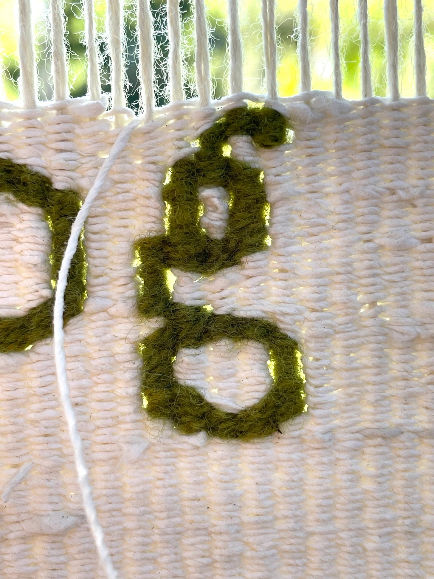
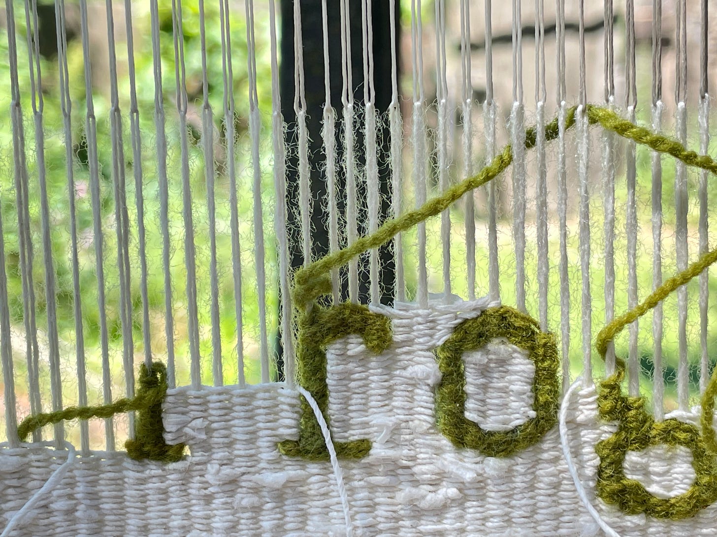
Well, mostly—though the very backlighting that makes it hard to see what I’m doing also clearly illuminates every letter formation issue. Each little stair step is visible. And so is the actual (vs perceived) thickness, tension and consistency of the weft yarn—especially where it is wrapped up a single warp. Useful to know. If sometimes not what I want to see.
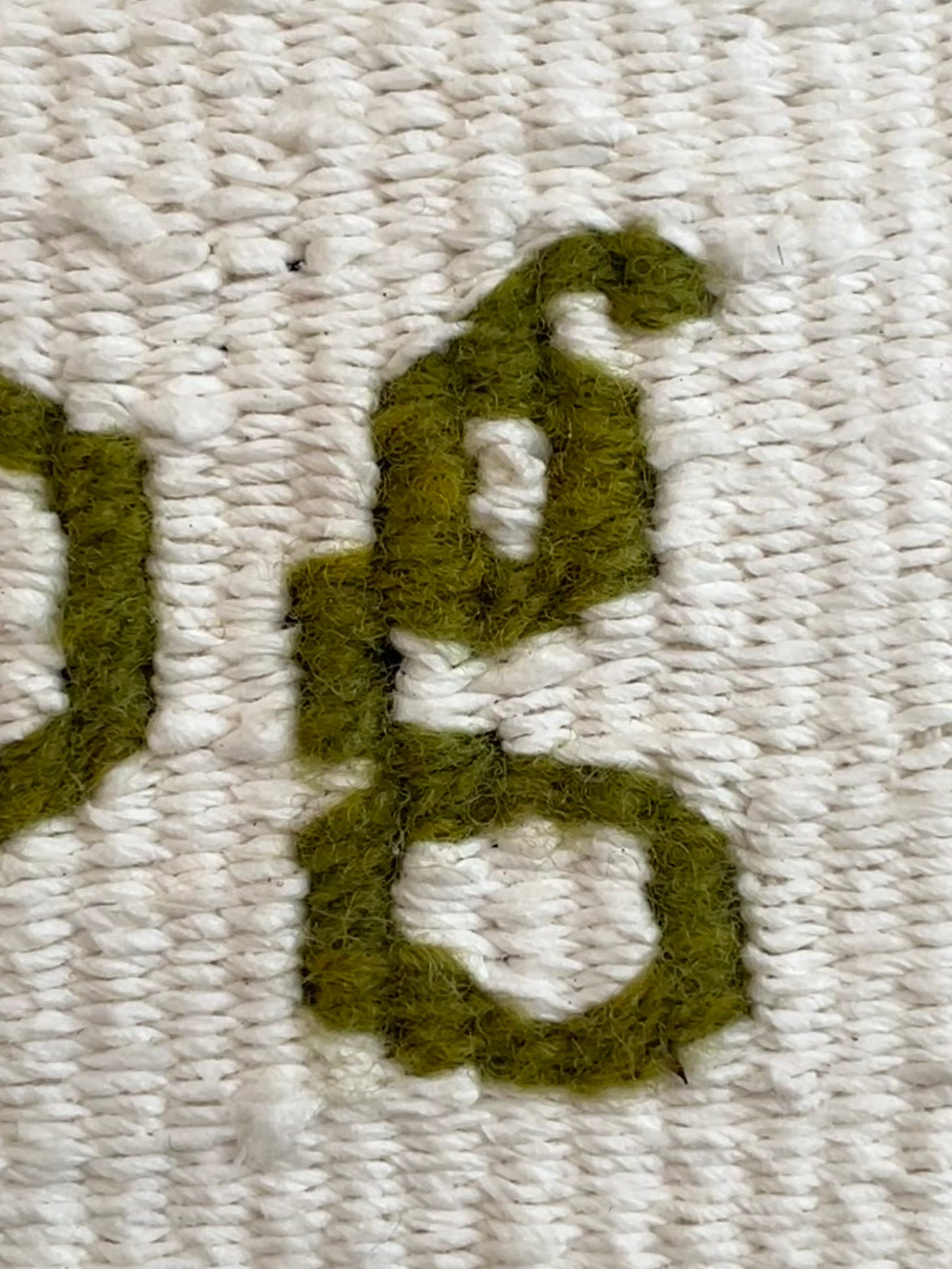
Lit from the front on the other hand (as most tapestries are when viewed), the slit lines grow dark, smoothing grid-driven curves and adding to the illusion of sinuous fullness—the slightly awkward g suddenly rendered relatively fluid. In other words, lulling me into complacency. To be sure you can still see the stair steps of the warp/weft structure, but subtlety matters when working fairly small and having access to both views can be helpful.
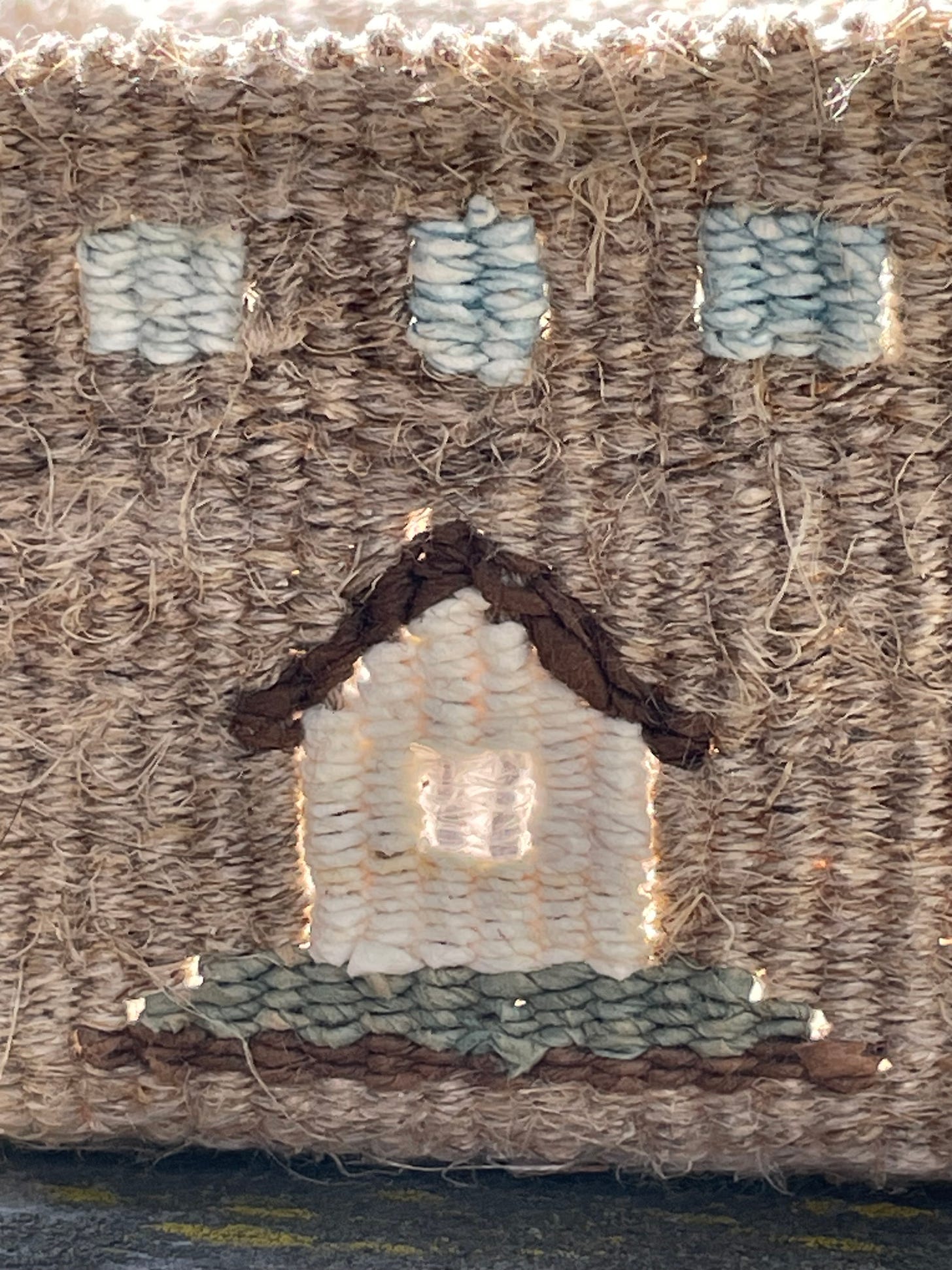
Of course backlighting doesn't always have to be about noticing and correcting “mistakes.” Slits are a marvelous design tool, and being able to make use of both kinds of light has led me to build things like tapestry mobiles and the box below. Why not add another dimension if you can?2
Design considerations aside—and given the constant shifting of the sun through the hours—I’m not above moving my loom to where the light is best for all of it: weaving ease, current aesthetic pleasure and keeping me honest. Why not? The loom moves and I’ve no one to please but myself. And Beryl of course, though she doesn’t care as long as I don’t move far.
A brief aside to you non-tapestry weavers for all this stuff about technique. Feel free to skip it and scroll to the bottom for a comic of me and my grand baby—or better yet, close your computer and do something else!
If you are interested in letter weaving however, and are giving it a go on your own, I hope the thoughts above and below are useful. Remember that for details on specific letters you can always zoom in closely on any that I’ve woven in the past.3
Now, back to the program.
If there is a “secret” to letter weaving, it is to remember that letters are just shapes, and like all shapes created on the grid of warp and weft are easier to weave on a large scale. At five warps per letter however (plus serifs where applicable), there are things that make a difference in both ease of weaving and appearance. I’ll try to touch on the big ones.
First, the relationship between warp, weft and sett.
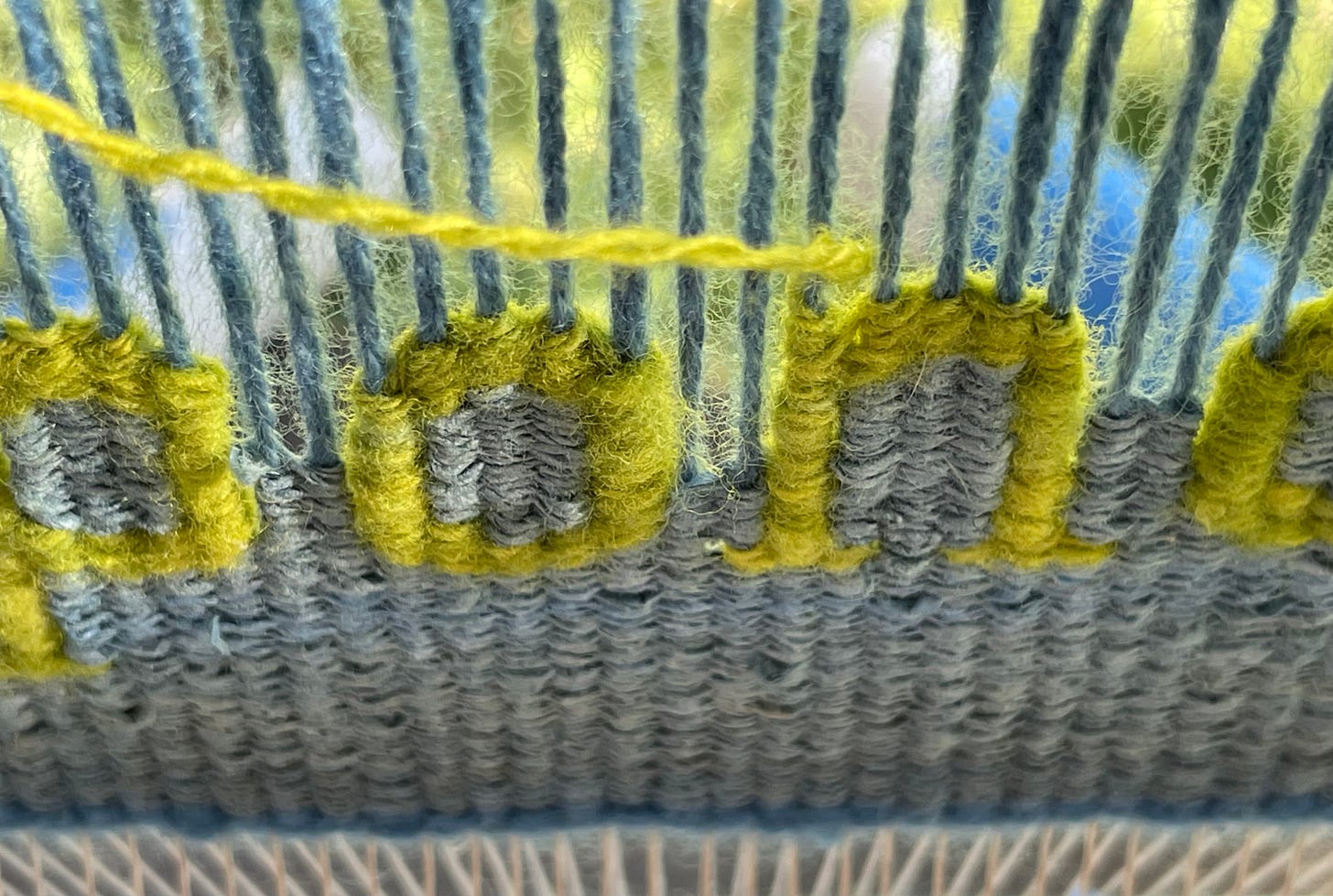
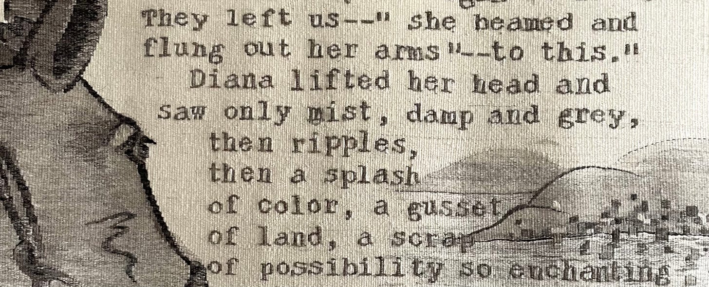
As you can see above with the letter g (especially the backlit one), the lines work best when they take up neither more nor less than their share of the available space between warps. Not enough (or sloppy turns with the ground weft), and the letters will bulge. Too much and you get letters that are all slit and no substance. It’s a constant balancing act, especially when combining different materials as I do here (wool and paper).
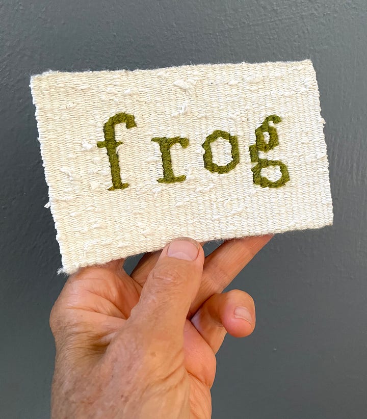
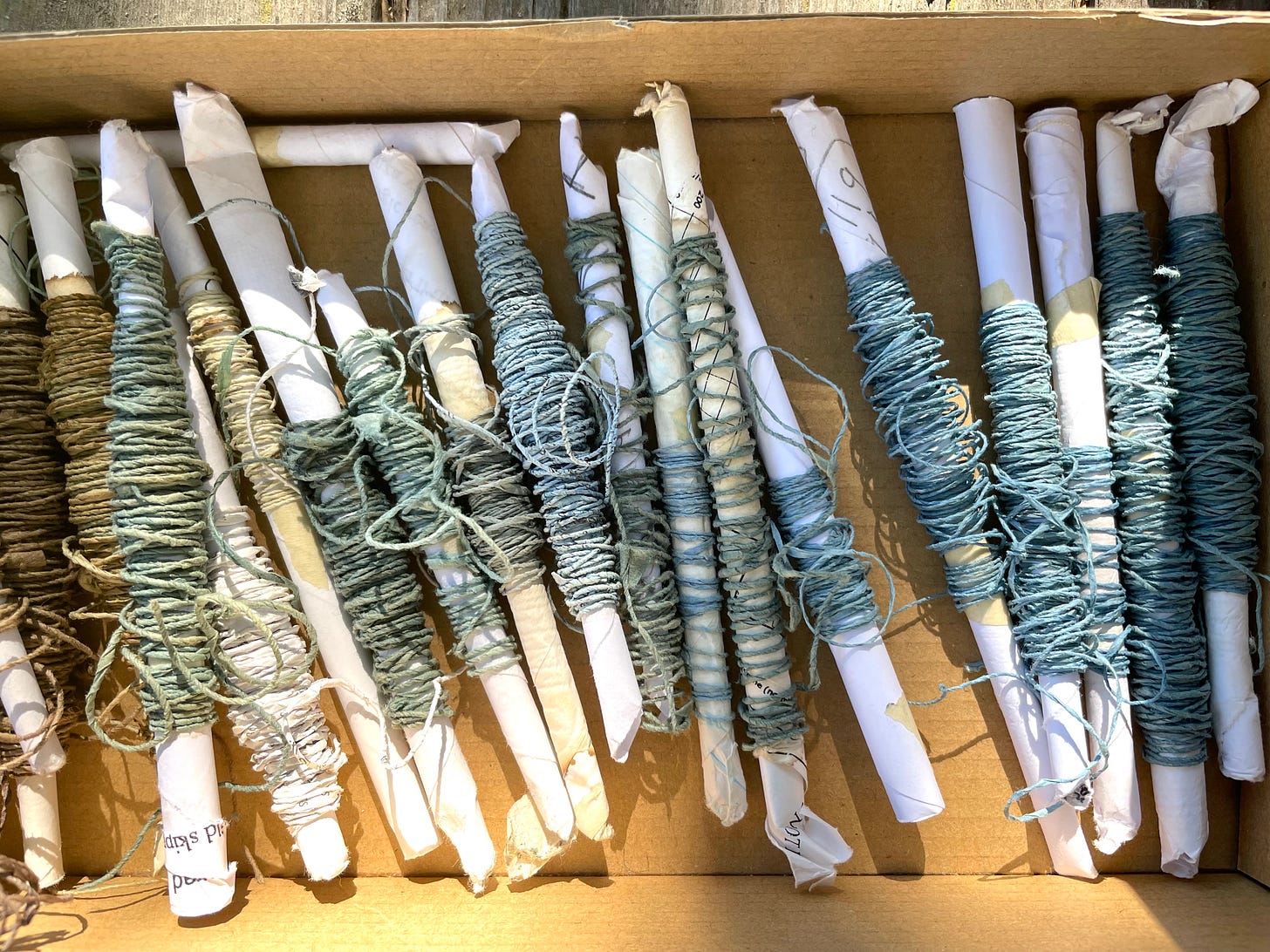
With frog I try to play it both ways. My background weft (hand spun coffee filter paper), is both inconsistent and inflexible so the slit width varies with every pass and there’s not much I can do about it. The wool letter weft is also hand spun and inconsistent but is very bouncy so I can continually adjust its tension in response to what is there.
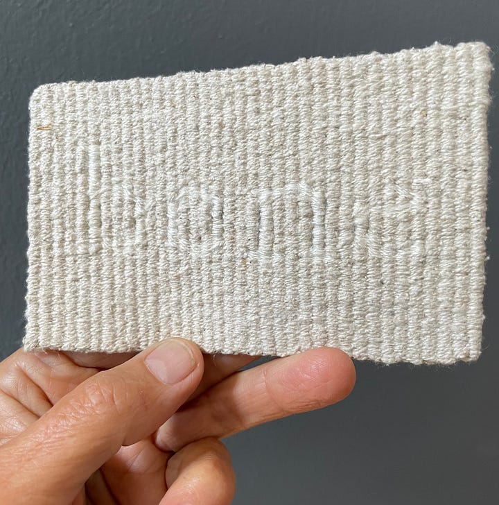
With pond, the wool weft is decidedly puffier than the paper ground weft (a different kind of coffee filter than I used with frog). I chose the wool deliberately. because the ground weft, though relatively consistent, is also very fine and leaves a lot of room between warps. If I’d chosen wool as fine as the paper the slits would have been enormous.
I could have dealt with this by doubling the paper strands but preferred the look of the singles paper. (Doubling the paper would doubtless have made the color blending a little easier as I was working with many small leftover bits—but hatching worked fine as I shifted from one to the next and the trade off seemed worth it at the time).
Of course you can avoid this kind of fiddling and get more consistent results (if you like such things), by weaving your words with mill-spun wool4 —something with very little bounce—for both background and letters. This will help the forms remain nice and crisp, especially when wrapping, and you can adjust your weft bundles to fit more closely with your warp and sett.
Another heads up here—this time about the focus issues in the video below; my phone couldn’t decide if it should focus on my hands or the tapestry-in-progress and chose both— alternately. It might be a little dizzifying. Alas, I didn’t see what had happened till the letter was woven and by then it was too late. Many apologies! In my next life I’ll tackle fancy video…
But back to weft bundles. Weaving smooth letter forms is easier if your weft is fine and your bundle built of two or more strands. You can divide them to outline curves and bring the strands back together for wrapping. You can also use a plied yarn—untwisting, separating and working the ends down different warps as I do at the top of the f in the video—though this is not as pleasant or good looking as working with actual separate strands.
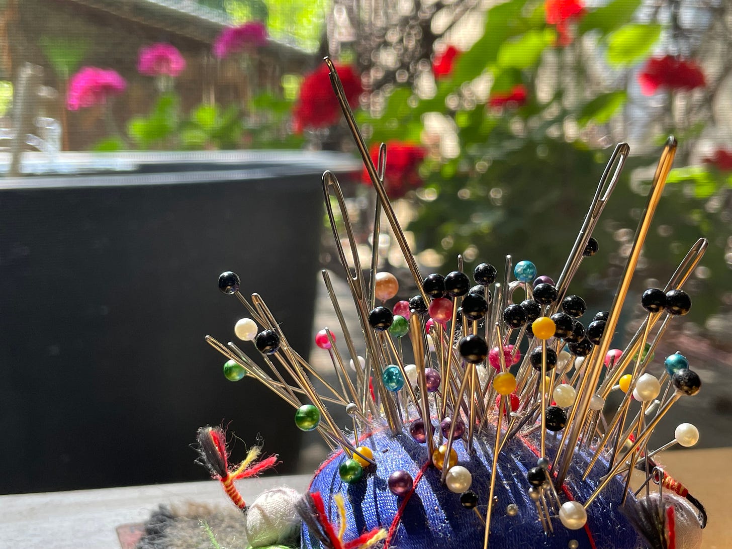
Speaking of working in all the ends, nothing is more helpful to my way of working than to have a variety of very sharp big(ish) eye needles to hand. Ideally the eye is easily threadable yet slim and the shaft as thin as possible so the threaded needle can slip down parallel to the warp to anchor the weft with minimal distortion. It is hard to get it perfect to be sure, and sometimes involves compromise, so use what you have and be ever on the lookout for the perfect one(s).
If weaving in the ends is not your jam, I assume it is possible to use pigtails or other starting and stopping techniques—or maybe even to leave weft hanging down the back for later use—but as I always tuck my tails5 and designed my letters around this technique, I can’t speak to the efficacy of any other approach.
That said though, I’m ever compelled by how the things we make are influenced by our particular weaving preferences. As I mentioned when talking to Anne Merrow on the Long Thread Podcast6 last week, there are myriad ways to get where you want to go and the “trick” if you will, is to choose which ones suit you best then string them together to get where you want to go. Somewhere completely personal and unexpected. Why struggle with a thing you hate because “that is how it is done,” when it is those tiny personal decisions that help each of us develop a signature—those ever evolving privately pleasurable techniques that lead to letters that look like ours.
Another thing I try to pay attention to is value.7 If I’m going to use a dark-ish ground weft for instance, I want my warp to match at the top and bottom where it shows, so will either spin something dark or dye the warp with indigo. Ditto light colored wefts (sans indigo dyeing cuz that’s not going to make it lighter :-)
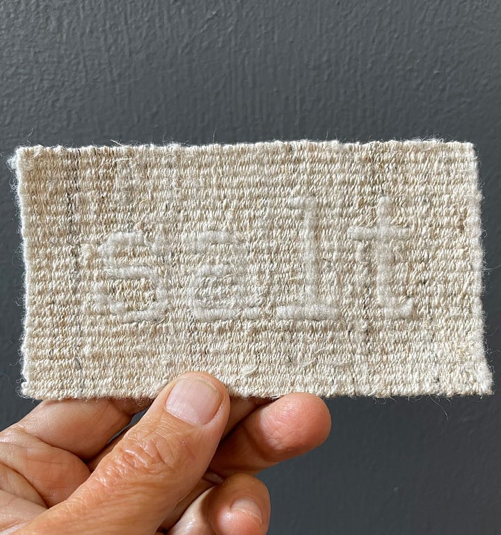
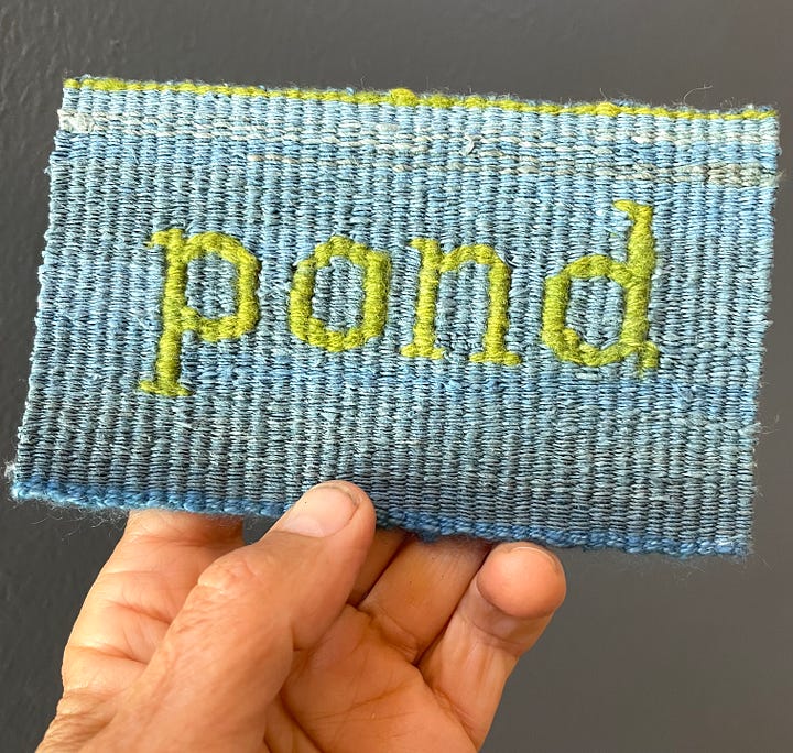
I then select the letter color to contrast, or work in some narrative or aesthetic way with the ground color. Occasionally I want the letters to almost vanish and choose yarns that are very close in value to achieve this:
for things that dissolve
like salt—
that you can’t see
like wind—

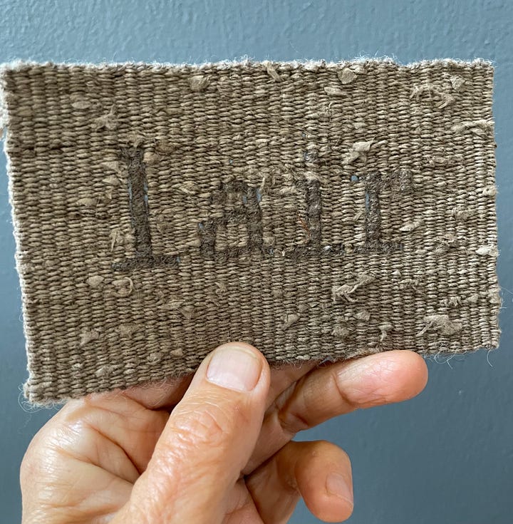
that are are hidden
like lair—
or bleached (and sometimes hidden)
like bone.
My eyes are always happier, while weaving and after, if there is a crisp value contrast. But sometimes the narrative wins…
The last thing I want to mention today is the notion of kerning, or the spacing between letters and individual characters. Computer generated text rarely leaves enough space between letters for comfortable weaving (at least at the size I’m making them)—so bear this in mind and adjust as you can. Type written letters on the other hand, are mono spaced—every letter and character taking up the same amount of space as every other—which leaves more room between characters.
Close kerning is only a potential problem if working with a cartoon though, and if you’re writing freehand you can just count and adjust everyone’s position to suit yourself. As I said earlier, I generally weave at five warps per letter with two warps between but that is subject to change. Some letters have serifs on both sides (as in the case of the letters m or k), and if they are next to other letters with serifs on both sides, I shift accordingly.
For all of the Rough Copy Tapestries I began with a cartoon, and that helped a lot when I was learning. I typed (or wrote by hand) on small pieces of paper then enlarged them 800%. At a sett of 8 epi with various wool warps, this worked with the five warps per letter structure—and is still what I still aim for even without a cartoon.
Of course your mileage may vary so do what feels and looks best to you cuz, as ever, that’s the fun and frustration of this whole making/inventing thing, eh?
And that, I think, is all I can think of to say—apparently my subconscious is done talking about woven words—
or maybe just needs some food?
Around here it is suddenly berry picking8 baby dandling time—and both can pretty much take over everything.
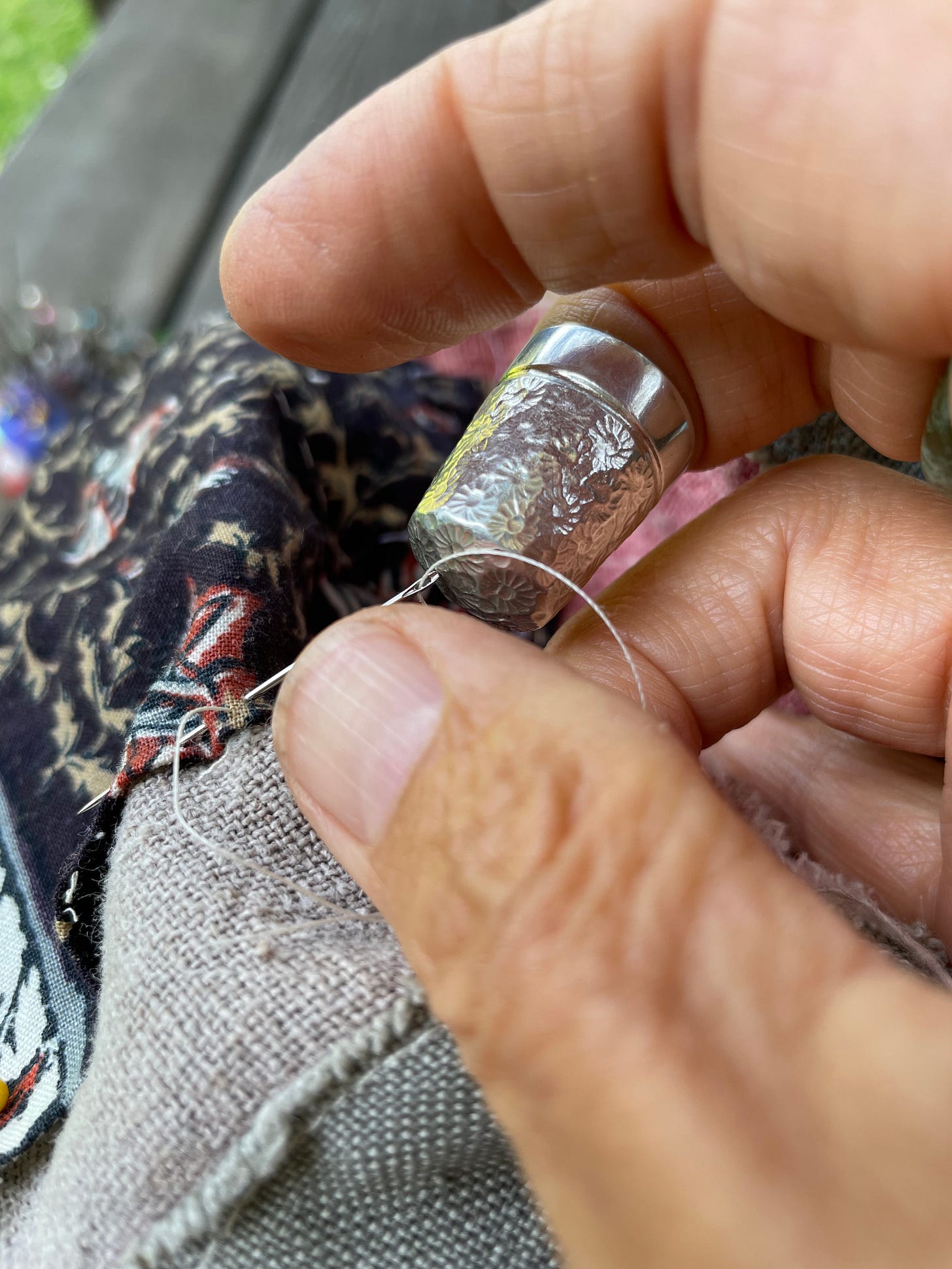
Indeed, I think I better go now, first to eat lunch and then finish patching the rip in the pocket of my picking apron so the quart container that nestles in there doesn’t fall through.
The raspberries are calling, and they are fleeting and generous things that I don’t want to miss a single one.9 Well, except for the ones the birds need. Plenty for all.
PS —I adore hearing your thoughts and observations in the comments and thank you so much for being part of the conversation—and for putting your words here (in the comments) rather than hitting reply to this note, for alas, if you accidentally choose the latter, your lovely thoughts will go to an unmonitored mailbox and I won’t see them!
I’ve been using this PVC pipe Loom for decades now and though not everyone’s favorite (ick, plastic!), it has much to recommend it.
2016 was definitely a year of mobiles. Only a few are on this page but it gives an idea. The photo below, of the back lit tiny house, is not a mobile but a three dimensional four selvedge box where light will always play a part in the design.
Tons of examples of letters in the Rough Copy Tapestries and the 99 Noun Project (69 little tapestries and counting), in the 2020, 2021 and 2022 Archive pages.
Rebecca Mezoff talks a lot about different sources of mill spun tapestry wool on her Blog, in her Classes, and on Change The Shed. I haven’t tried any of the yarns she talks about but if I weren’t spinning my own might start with Array from Gist Yarn and Fiber, the tapestry yarn from Weaversbazaar , or the Koehler Tapestry Yarn from Harrisville Designs, depending. I understand that they are all quite different, so do check out Rebecca’s abundant information if you’re looking as she has so much experience with these and other available weft yarns.
Tucking The Tails is my guide to weaving in the ends as I go and on page 15 has drawings of how I use the needle for letters.
It was a long chat, and I can’t remember exactly where I said it though I think it was toward the end? At any rate, here’s the link if you need it: Long Thread Podcast.
The Value of Value is a long blog post I wrote that covers this topic in detail
This week’s picking brought to you by raspberries, cherries and serviceberries. The last might actually be my very favorite in that they are everywhere right now. Amelanchier anlifolium is a native here in the northwestern part of North America, and the berries are wildly abundant this year. Ever on the lookout when walking with beryl, I’ve found a number of new locations this year; my teeth seem to be perpetually purple and I worry about smiling at the (very few) people I meet when we’re out at 5:30 in the morning,
For more on this magnificent berry, I HIGHLY recommend reading (or better yet, listening to) Robin Wall Kimmerer’s essay: Serviceberry: An Economy of Abundance. It is simply glorious, especially when read by her.
Anyone else have a special berry/fruit picking setup? Before the big-pocket apron I used containers that hung from my neck and buckets that fit on a belt. Both worked, but the apron (now almost entirely patches cuz wild thorny blackberries are my favorite) is the best.







Robin Wall Kimmerer's Braiding Sweetgrass is a life changing book. Such kindness and generosity to people like me, who came to her land, loved it, take the opportunities and often forget to credit her people's wisdom and care that this land despite white people's foolishness, continues to be beautiful.
I try to get everyone to read it! And anything else she writes.
I love being serendipitously part of your artists life. The serendipity you allow to be involved speaks loudly. I really like the smidgin of video to see the weaving or life in action.